
Designing for Clarity, Empathy,
and Action in Times of Crisis
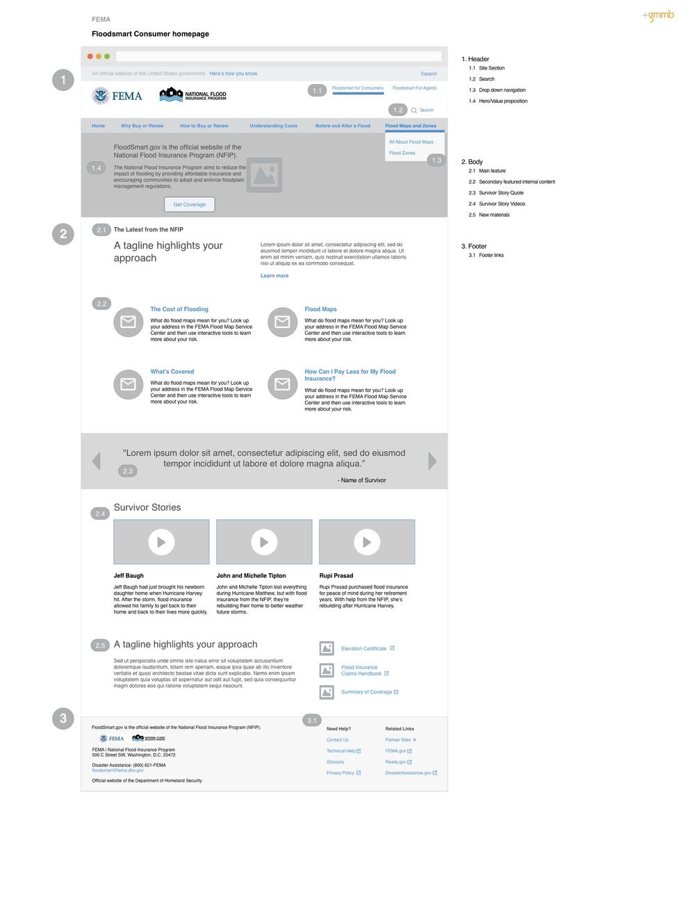
FEMA’s FloodSmart web site was redesigned and launched to reflect a multi campaigned, rebranded and rearchitected website.
Year
2017
Client
FEMA
Overview
This project involved a complete redesign of FEMA’s National Flood Insurance Program (NFIP) public-facing website. The objective was to create an experience that better served two key audiences:
Consumers seeking to understand, purchase, or manage flood insurance
Insurance agents who needed tools and resources to support clients—especially during or after flood events
The existing site was dense, difficult to navigate, and failed to convey the urgency and importance of flood insurance in a clear or human way. FEMA recognized the need for a site that was informative, empathetic, accessible, and action-oriented—one that could help increase adoption, improve preparedness, and support recovery.
The Problem
The legacy NFIP website presented multiple challenges:
Overwhelming content structure that buried essential information
Ineffective navigation, making it hard for users to find key resources
Lack of emotional resonance, particularly for users in crisis
Accessibility gaps, preventing full compliance with Section 508 and WCAG standards
As a result, both consumers and agents struggled to get what they needed—often in high-stress, time-sensitive situations. FEMA saw this as an opportunity to rebuild trust, improve clarity, and make the site a reliable support tool before, during, and after flood events.
Key stakeholders included FEMA’s digital communications team, NFIP policy experts, and insurance agent representatives.
Our discovery process included:
Stakeholder interviews to define goals and gather institutional priorities
Content audits to streamline and modernize dense policy information
Usability testing on the legacy site to identify friction points
One major insight: context matters. Many users visited the site under emotional strain—either preparing for a potential flood or dealing with the aftermath. This finding underscored the need for calm, intuitive design and empathetic tone.
Agents, on the other hand, needed fast, reliable access to forms, checklists, and policy details—resources they could reference in real time with clients.


Design Process
Design Process
Discovery & Research
We structured our design process around dual user journeys—one for consumers and one for agents.
Key actions included:
Redefining the information architecture (IA): Clearly separating educational content, claims support, and agent tools.
Creating dual calls to action: “Learn about Flood Insurance” for consumers and “Support Your Clients” for agents.
Designing for accessibility: Integrating WCAG and Section 508 compliance from the start—testing color contrast, keyboard navigation, and screen reader performance throughout the build.
Collaborating cross-functionally: Working with content strategists to rewrite legal-heavy text into plain, approachable language without sacrificing accuracy.
Iterative design reviews: Involving FEMA stakeholders and external advisors for alignment at every stage.
This process ensured every decision balanced clarity, compliance, and compassion.
The Solution
The final redesign delivered a dual-track experience that addressed the needs of both audiences:
For Consumers:
Simplified policy explainers using plain language and visual aids
A ZIP-code-based flood risk lookup tool for personalized insights
Clear, empathetic CTAs guiding users to take protective action
Visual hierarchy and iconography to improve scannability under stress
For Insurance Agents:
Quick-access dashboards for forms, checklists, and client guidance tools
Step-by-step resources to assist clients in filing claims or renewing coverage
Improved navigation structure for faster task completion
The redesigned site emphasized readability, usability, and trustworthiness, transforming NFIP.gov into a digital experience that supports users through every stage of the flood preparedness journey.
Impact
Post-launch analytics and feedback demonstrated measurable improvements:
Significant drop in bounce rates, indicating improved navigation and content engagement
Increased engagement on key task-based pages such as “How to File a Claim” and “Find an Agent”
Positive qualitative feedback from FEMA teams and users praising clarity, tone, and ease of use
Strengthened perception of NFIP as a trusted, empathetic government resource
Key Learnings
This project highlighted the importance of designing for both functional and emotional contexts.
Key takeaways include:
Empathy is a design tool: Many users engage with FEMA content during moments of fear or loss; tone and clarity can ease stress and drive action.
Accessibility isn’t an afterthought: Integrating inclusive design early ensures everyone can access life-critical information.
Stakeholder alignment drives success: Ongoing collaboration across policy, content, and design ensured consistency and trust.
Designing with empathy and structure transformed NFIP.gov from a static information portal into a responsive, supportive experience that truly serves people when they need it most.